Role: Founder & Designer
Project Type: Brand Strategy, Market Research, UX-informed Visual Identity
Duration: April 2020 – July 2023
Tools: Adobe Suite, user interviews, online surveys, SEO tools, Shopify
Skills Used: User research, competitive analysis, brand identity design, digital marketing, SEO, accessibility.
Project Type: Brand Strategy, Market Research, UX-informed Visual Identity
Duration: April 2020 – July 2023
Tools: Adobe Suite, user interviews, online surveys, SEO tools, Shopify
Skills Used: User research, competitive analysis, brand identity design, digital marketing, SEO, accessibility.
> The Problem
In early 2020, I wanted to launch a small business that not only sold products but stood for something, I noticed that many sustainable brands either felt too “luxury” or lacked clarity in their mission. I saw an opportunity to create a warm, approachable, ethically-driven brand that connected with real people, not just idealistic marketing personas.
In early 2020, I wanted to launch a small business that not only sold products but stood for something, I noticed that many sustainable brands either felt too “luxury” or lacked clarity in their mission. I saw an opportunity to create a warm, approachable, ethically-driven brand that connected with real people, not just idealistic marketing personas.
> The Challenge
How do I design a brand identity and online experience that reflects authentic environmental values, is inclusive, and drives real engagement?
How do I design a brand identity and online experience that reflects authentic environmental values, is inclusive, and drives real engagement?
> Research & Insights
For the Market Research, I audited 10+ sustainable and eco-conscious brands, looked at their visual language, tone, and product lines. Noted trends like muted colour palettes, minimal typography, and often impersonal tone.
As primary and secondary research, I conducted 8 informal interviews with sustainability-conscious peers and online listening across Reddit, Blogs and Instagram to see how people talk about sustainability.
Key insights: People were skeptical of “greenwashing”. There was a strong desire for transparent values, community, and relatability. Visuals that were too clean or corporate felt untrustworthy or elitist, younger generations wanted to contribute but find sustainable behaviours impractical to incorporate in their daily life.
> Strategy
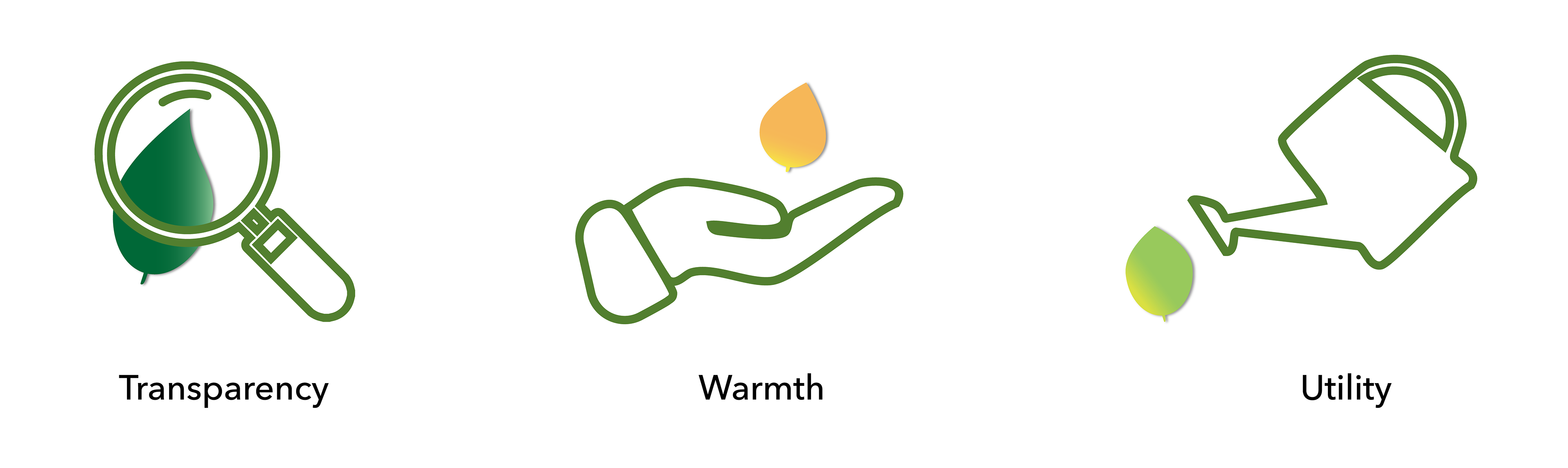
I built Avivant around three core principles:
Transparency – clarity in sourcing, mission, and messaging.
Warmth – visual and verbal tone that invites people in, not preaches at them.
Utility – products and content that support everyday sustainable living.
I built Avivant around three core principles:
Transparency – clarity in sourcing, mission, and messaging.
Warmth – visual and verbal tone that invites people in, not preaches at them.
Utility – products and content that support everyday sustainable living.
> Execution
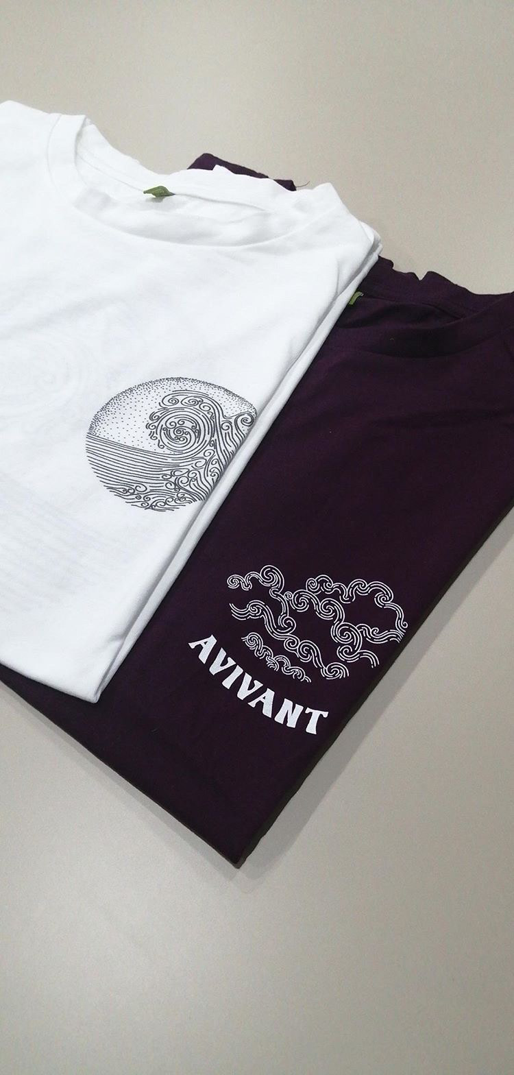
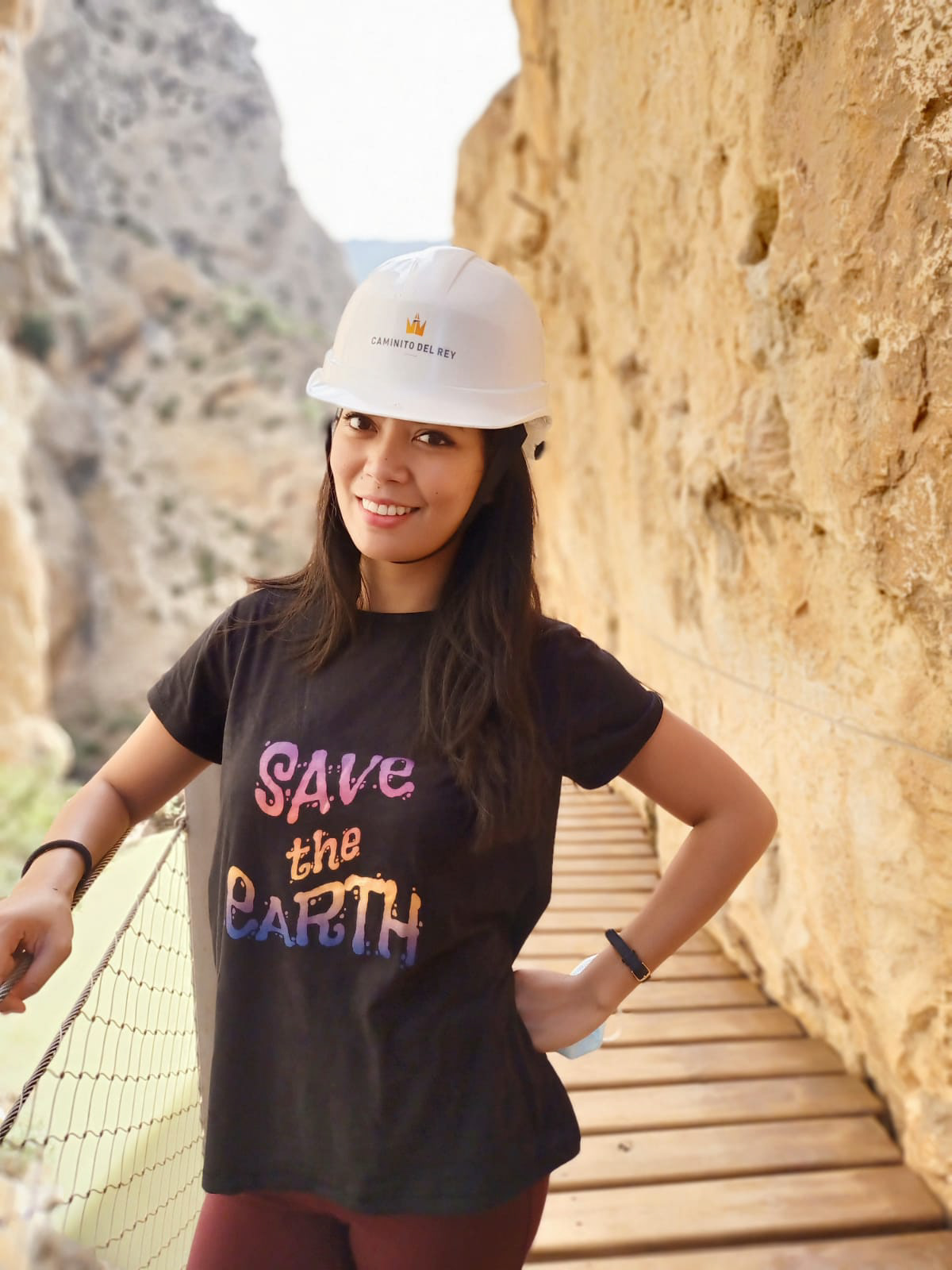
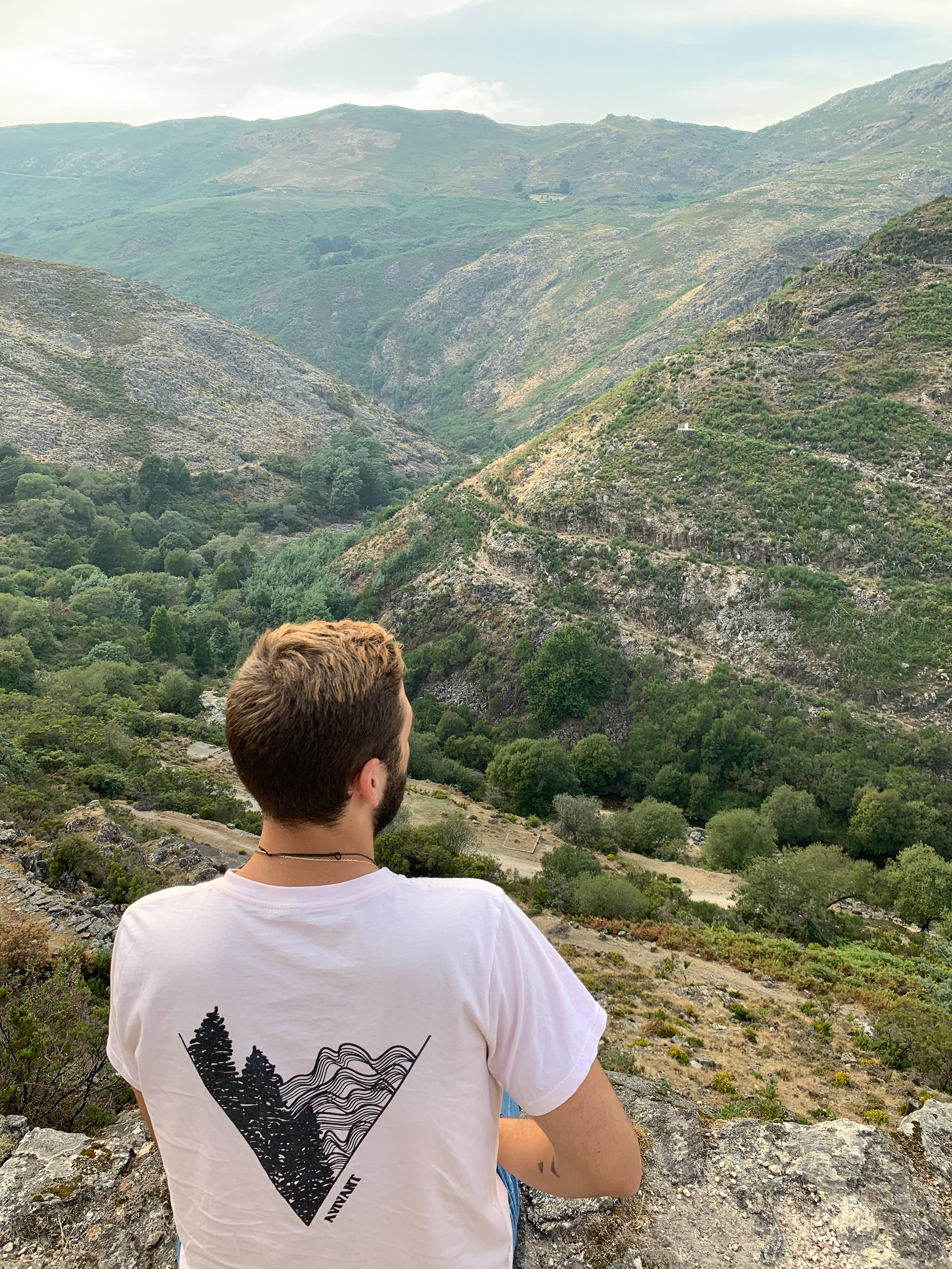
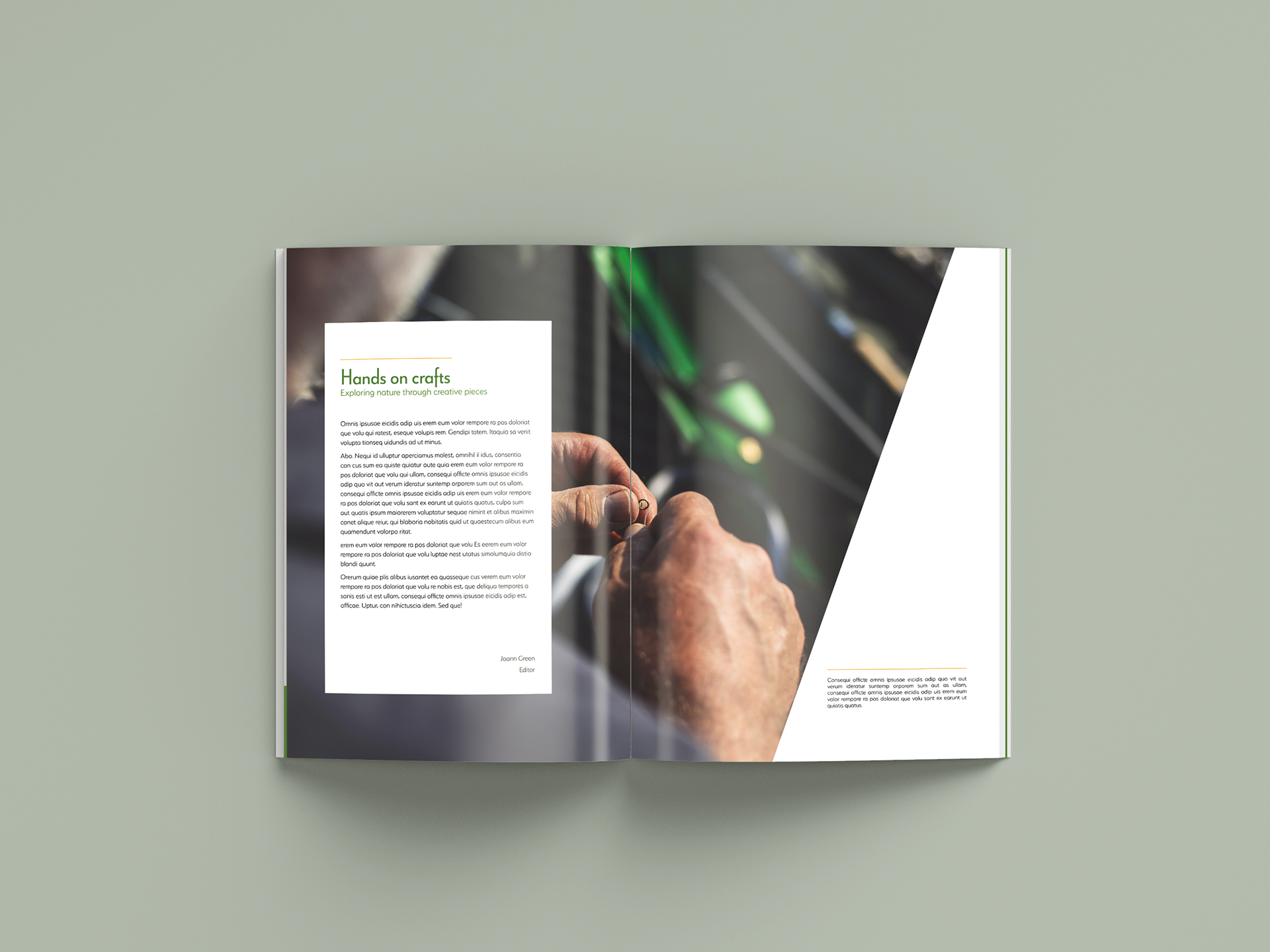
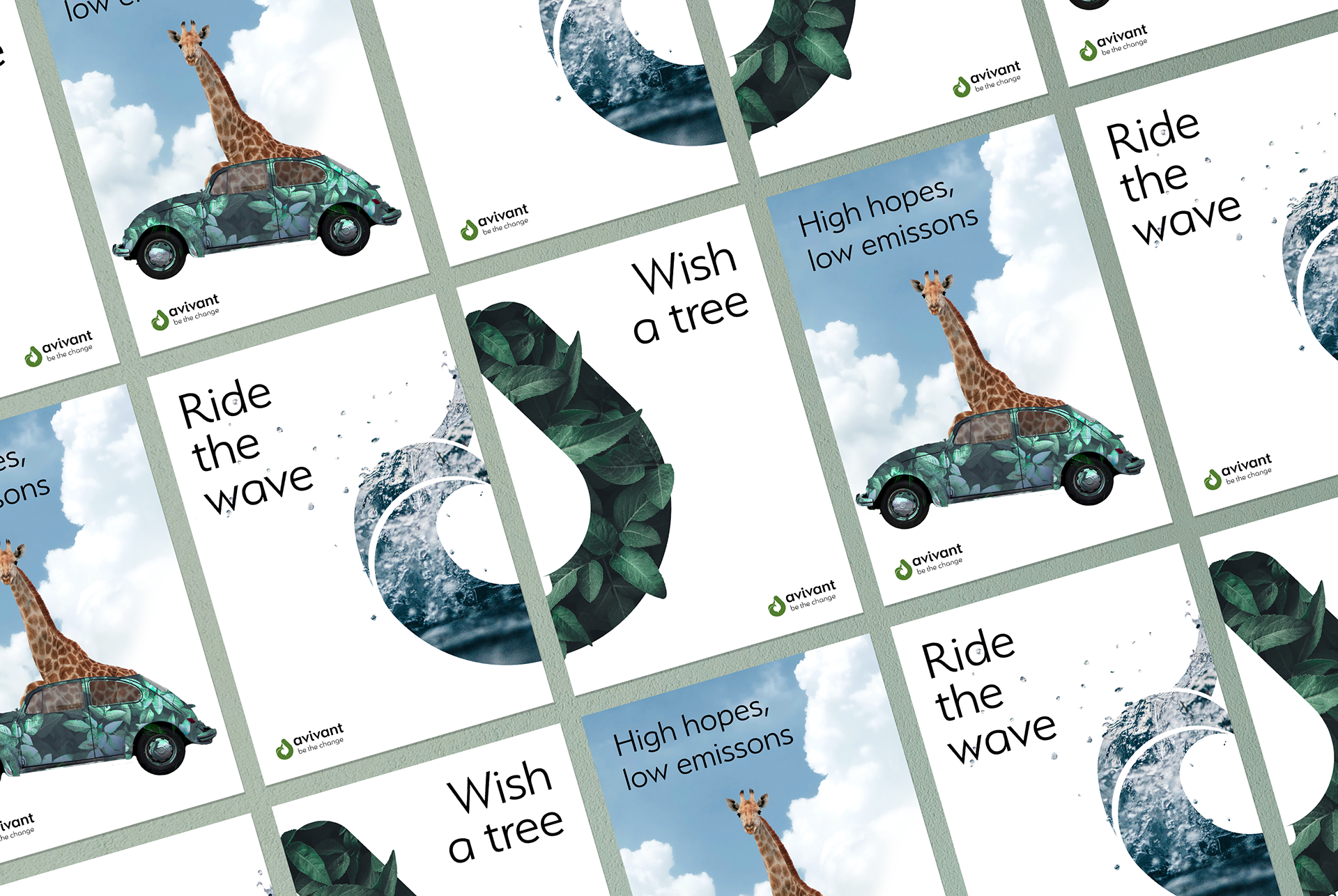
Brand Identity
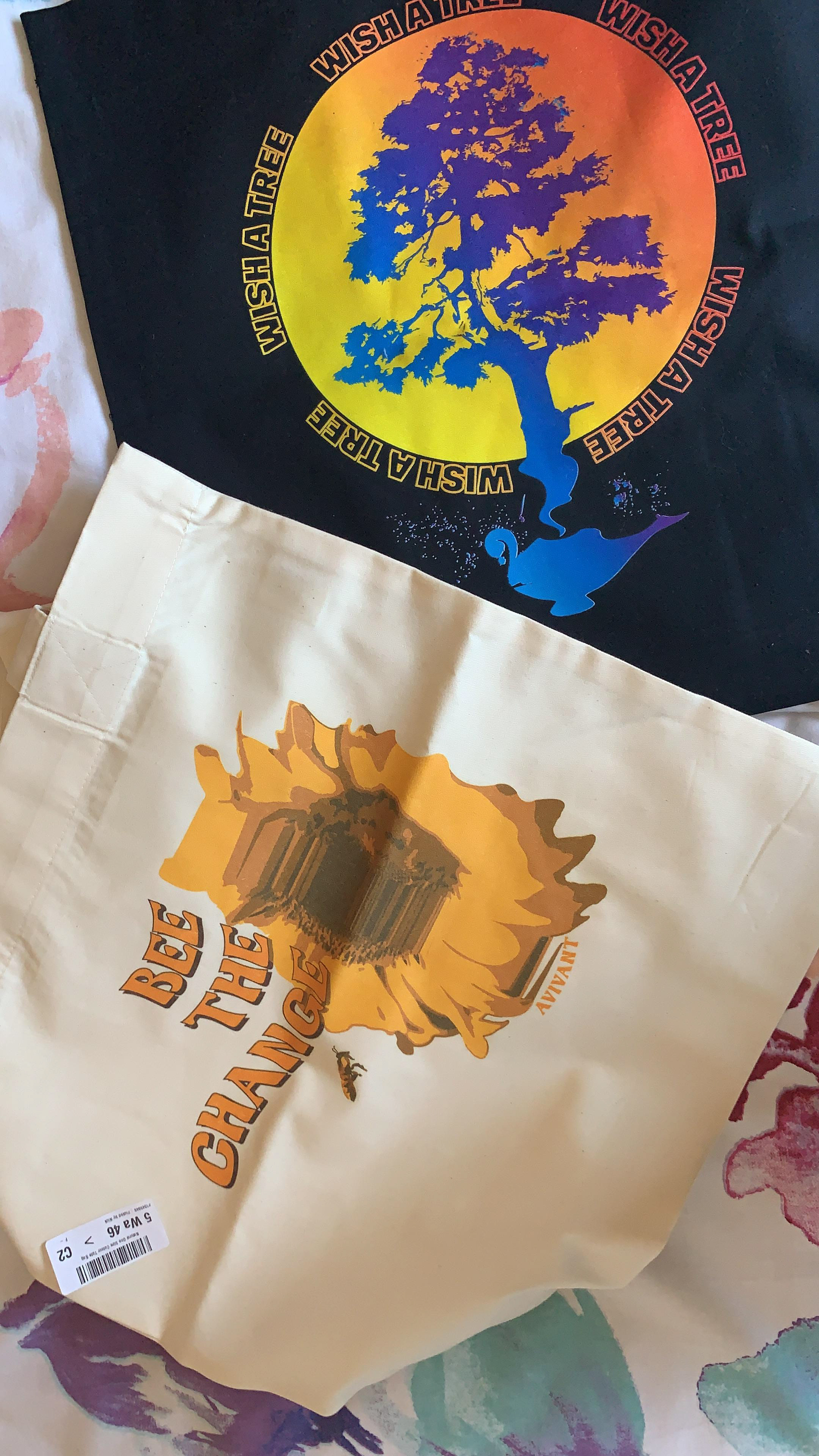
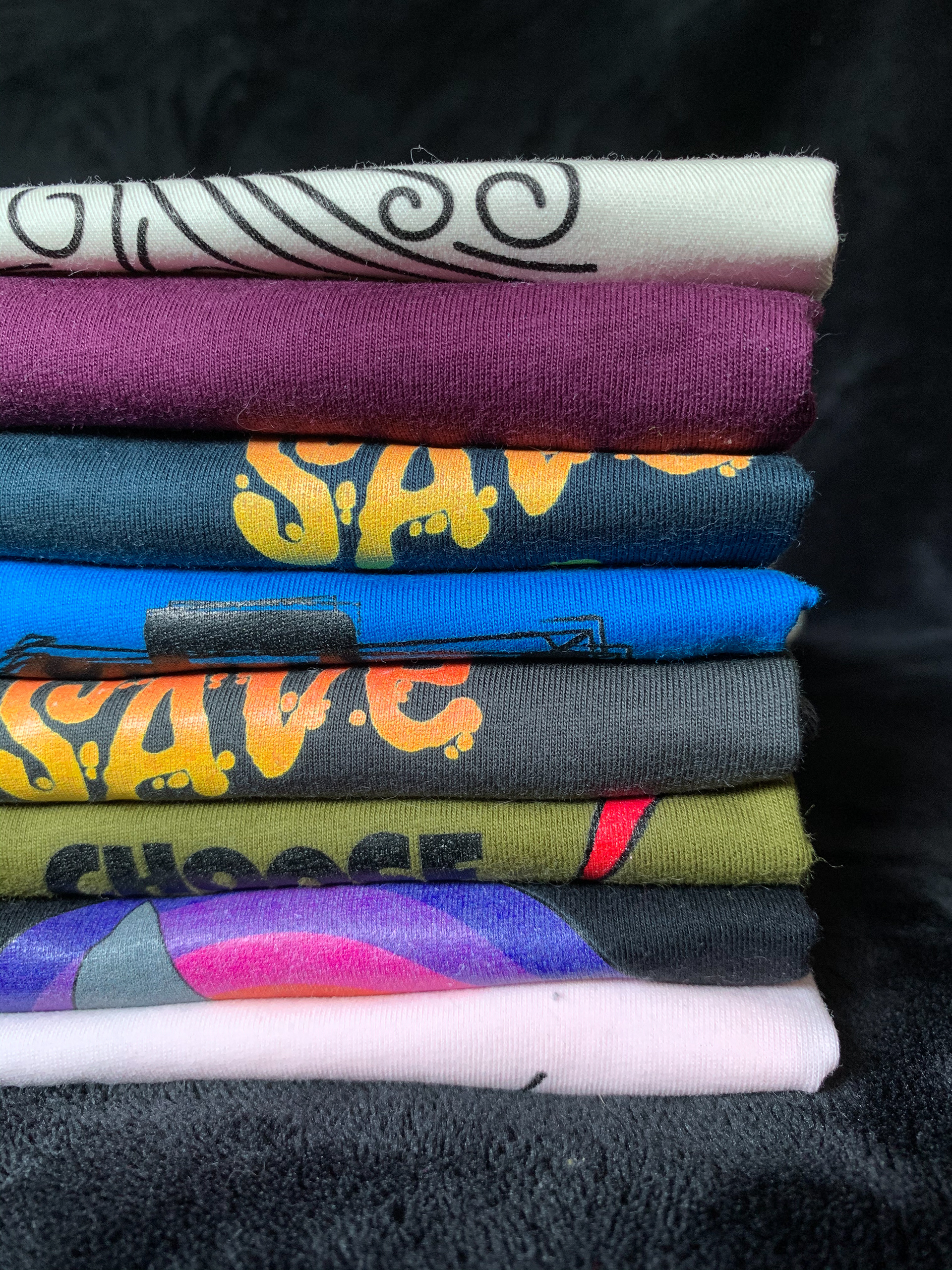
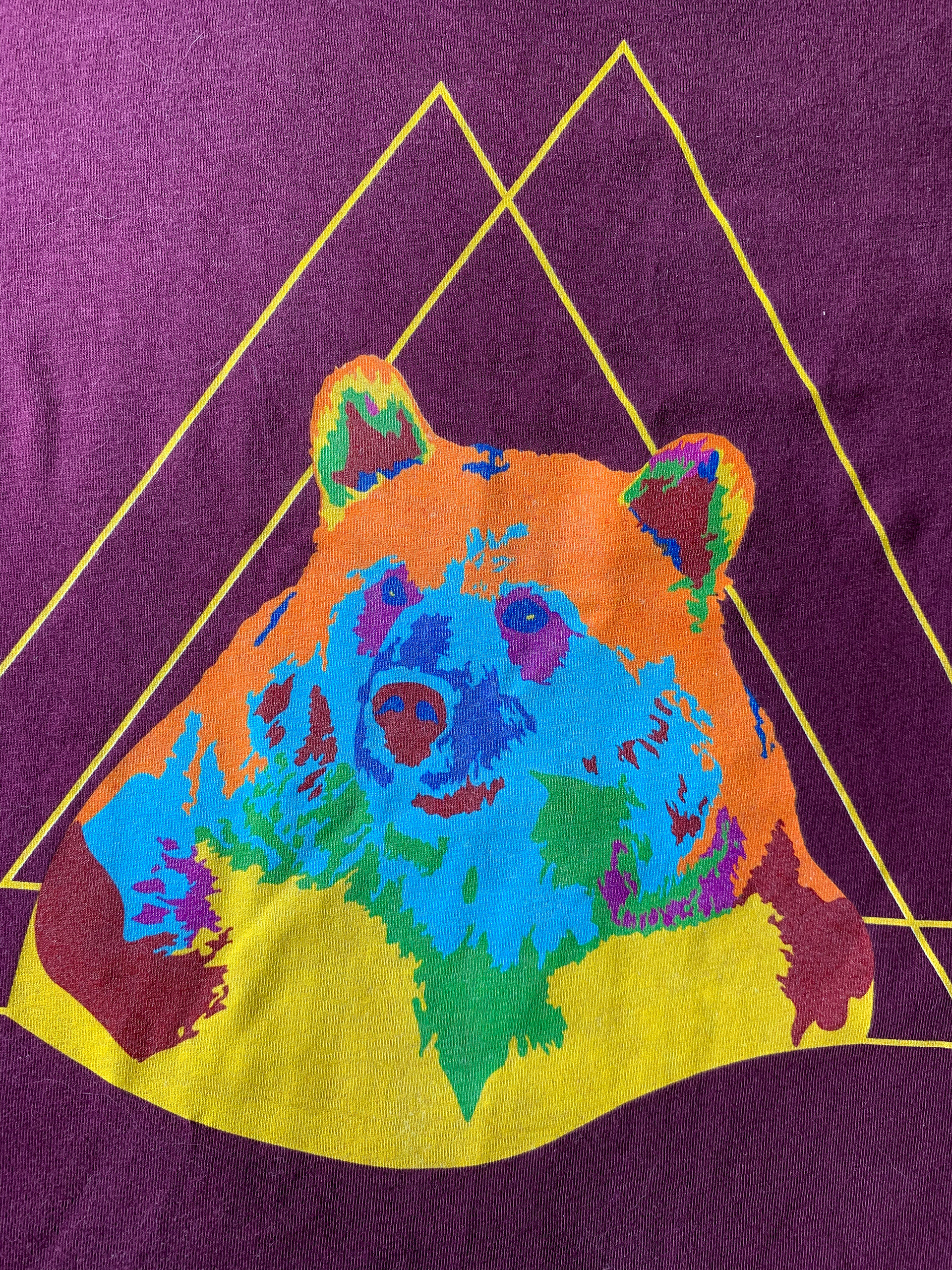
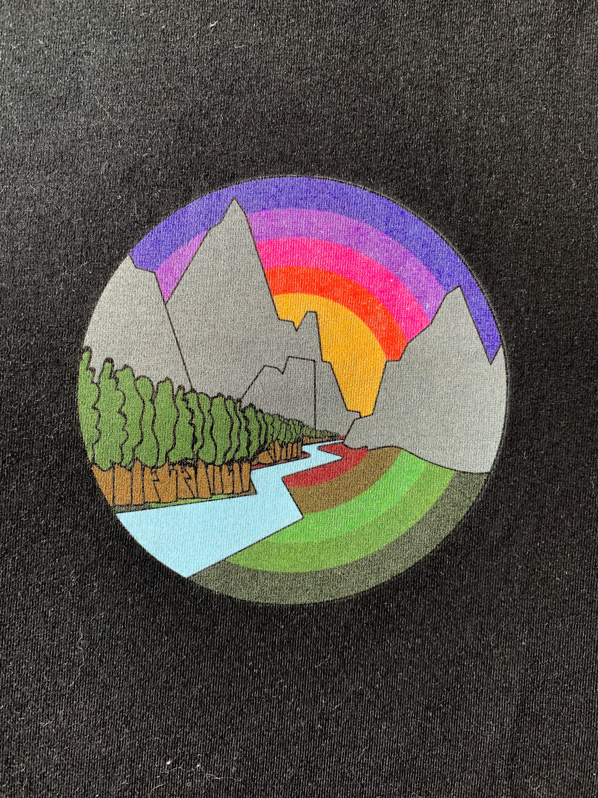
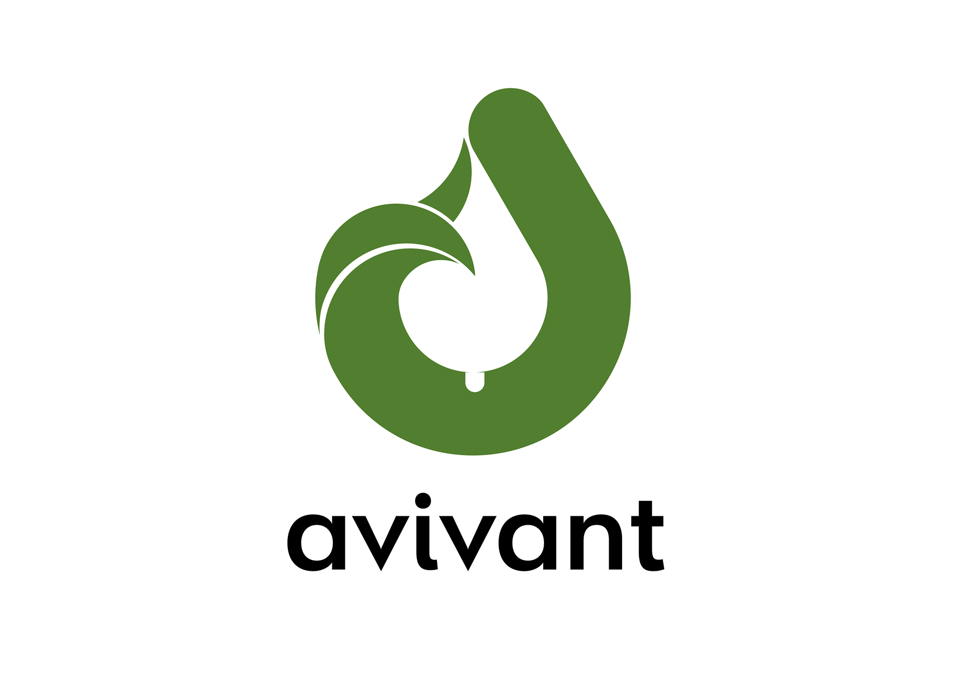
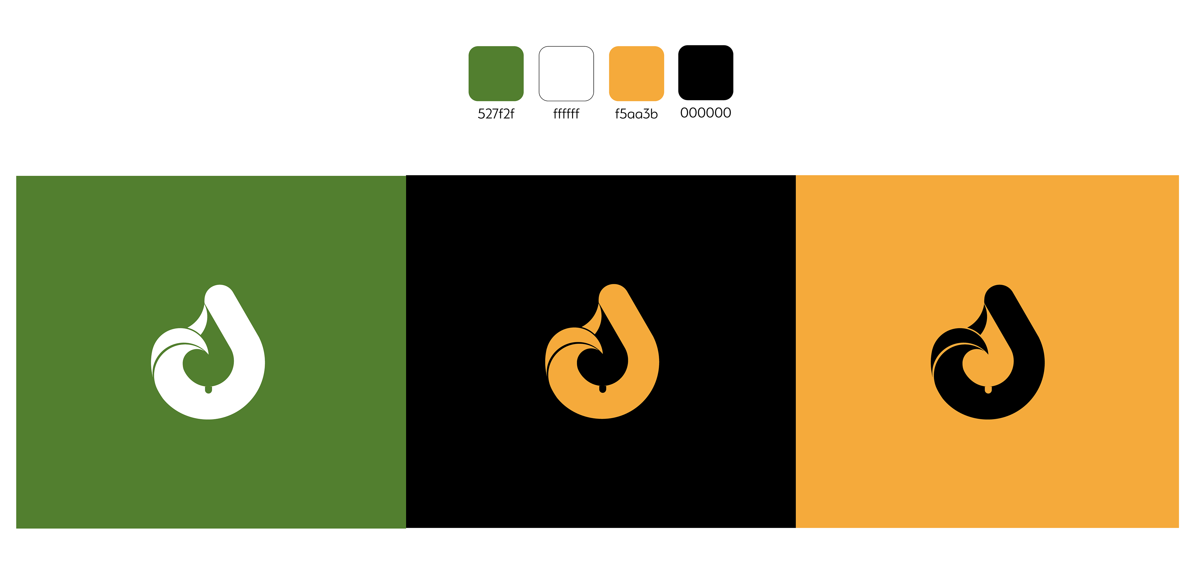
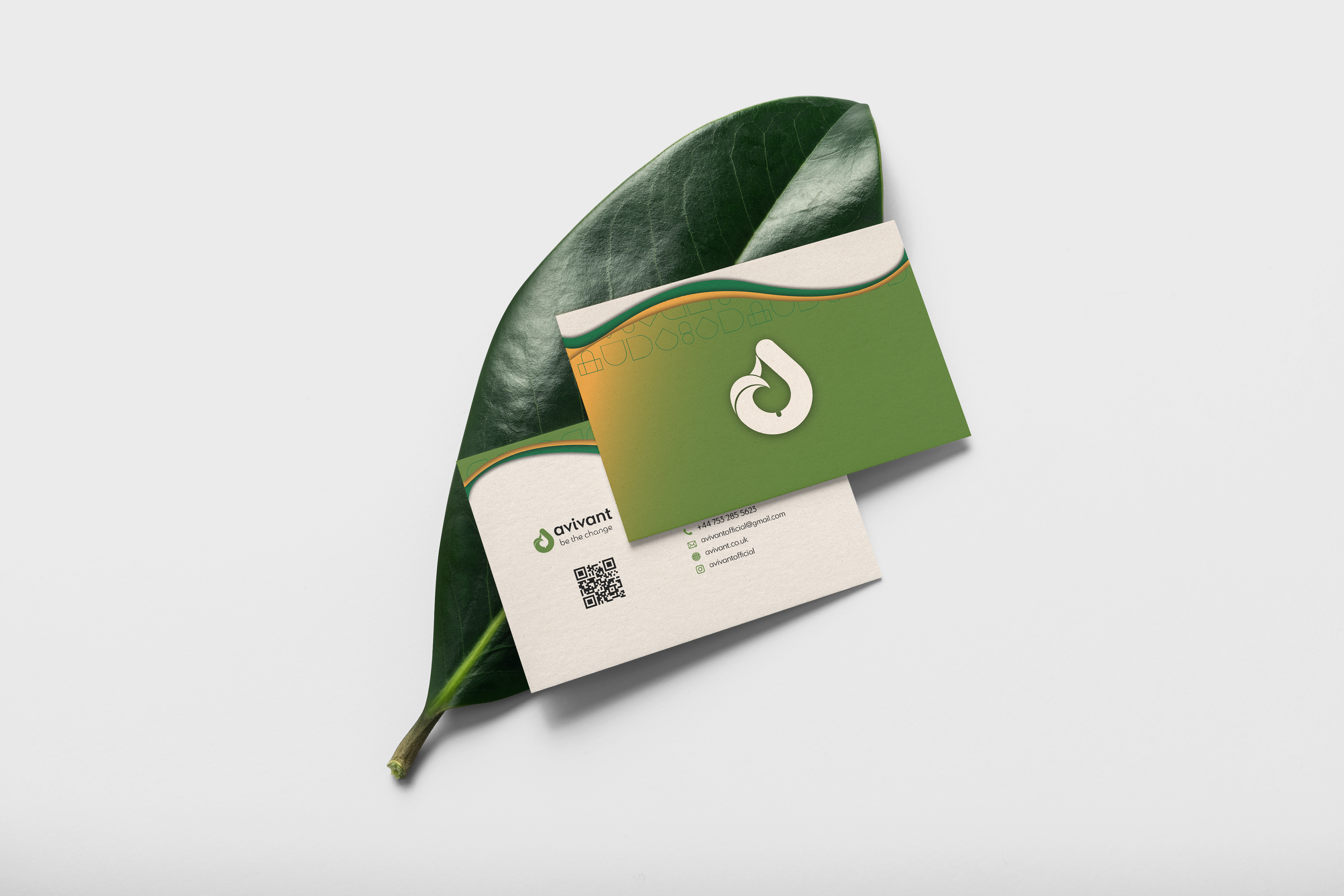
Logo: A hand-drawn symbol inspired by cyclical nature forms (i.e leaves, loops). An animated logo.
Colour palette: Earth tones (soft greens, terracotta, yellow) to feel natural and grounded.
Typography: A humanist sans-serif paired with a subtle serif for warmth and approachability.
Voice: Friendly, clear, values-driven without being overbearing.
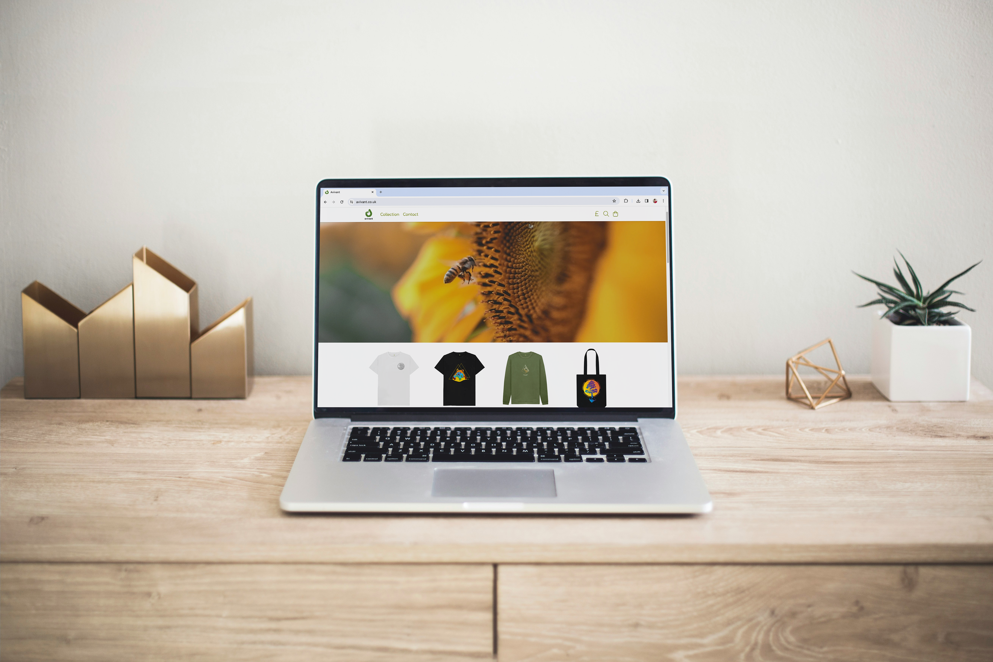
Website
Designed with accessibility in mind: strong contrast, alt text, readable font sizes. Added microcopy around product use, sourcing, and impact.
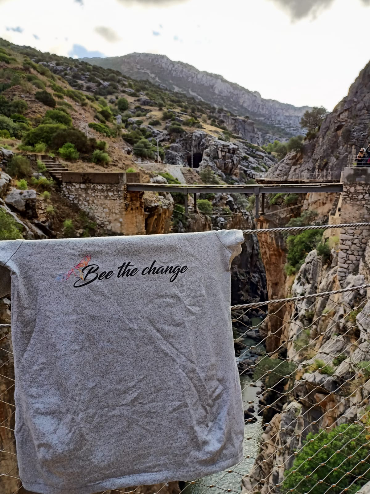
Digital Marketing
Designed SEO-optimised visuals for Instagram and website.
Ran low-budget PPC ads and tracked engagement (up to 23% increase in interaction).
Created educational content and campaigns tied to fundraising for food banks.
Brand Identity
Logo: A hand-drawn symbol inspired by cyclical nature forms (i.e leaves, loops). An animated logo.
Colour palette: Earth tones (soft greens, terracotta, yellow) to feel natural and grounded.
Typography: A humanist sans-serif paired with a subtle serif for warmth and approachability.
Voice: Friendly, clear, values-driven without being overbearing.
Website
Designed with accessibility in mind: strong contrast, alt text, readable font sizes. Added microcopy around product use, sourcing, and impact.
Digital Marketing
Designed SEO-optimised visuals for Instagram and website.
Ran low-budget PPC ads and tracked engagement (up to 23% increase in interaction).
Created educational content and campaigns tied to fundraising for food banks.

> Outcomes
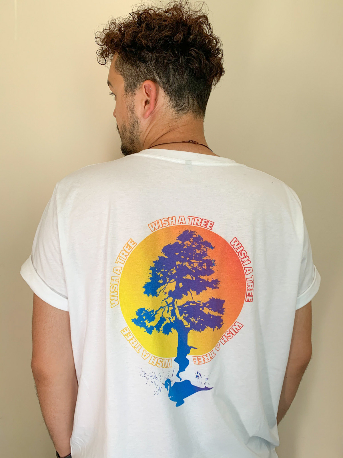
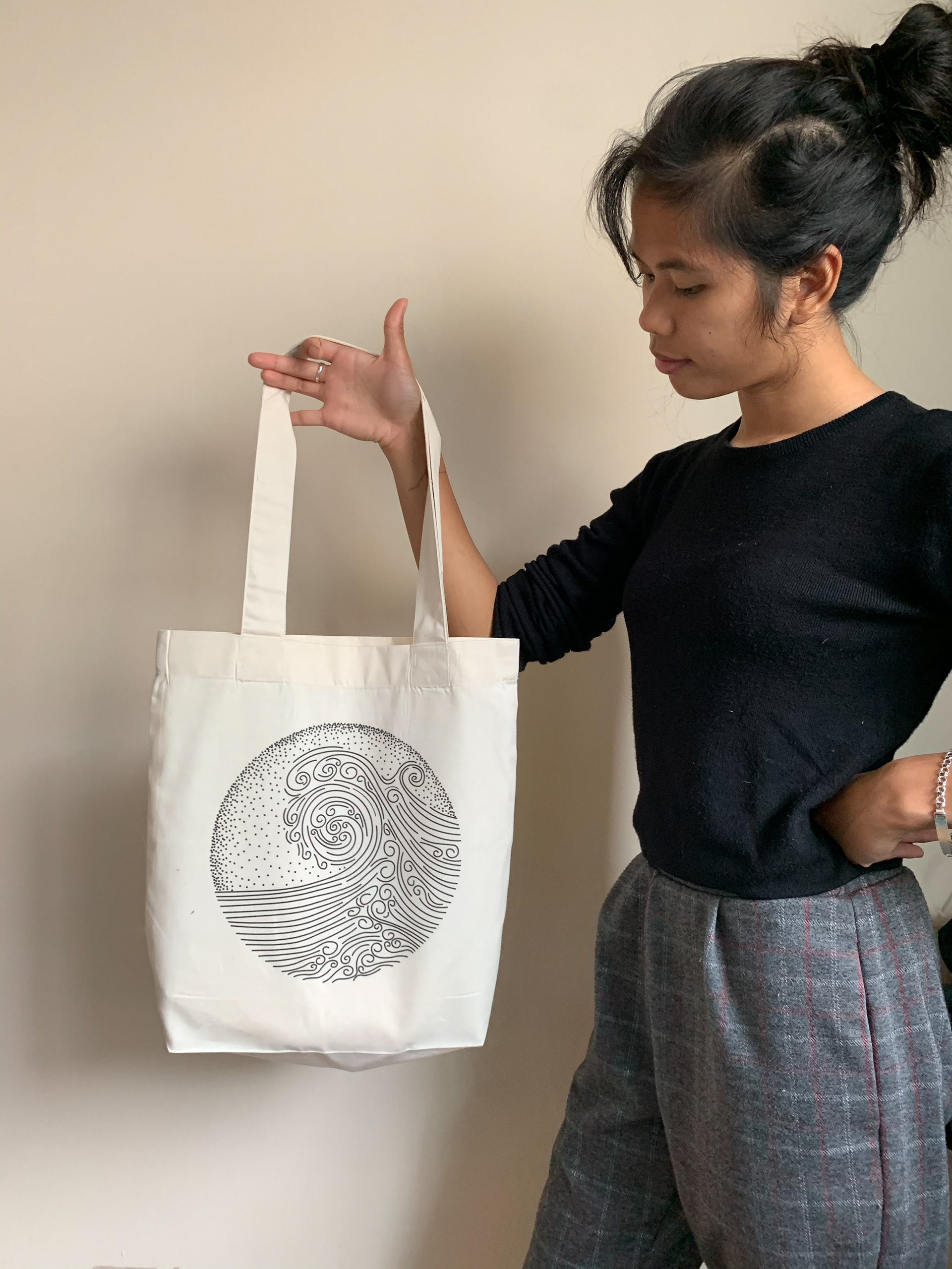
Built a brand that attracted a small but highly engaged community. Social engagement up 45%, with users reposting and commenting on clarity and authenticity. Raised funds through campaign-based product launches (e.g. tote bags supporting local charities). Recognised for accessible design and inclusive messaging by collaborators and customers.
> Reflection
Avivant was more than a design exercise — it was a real-world test of UX thinking, empathy, and systems design. I applied user insight to every aspect: branding, communication, interface, and behaviour. It confirmed how design can guide trust, build community, and drive action in subtle, meaningful ways.